
Custom Shopify reports and analytics with Mixtable
 Analytics Spreadsheet Updated October 16, 2026
 On this page
- Choose the right approach
- Before you begin
- Analytics columns on a Shopify data worksheet
- Time Series worksheets
- Pivot Table worksheets
- How the three fit together
- What you can analyze
- Control the dates and orders included
- Every report is still a spreadsheet
- Reports and spreadsheet templates are different
Mixtable calculates analytics from your Shopify store data and delivers the results as custom reports in a spreadsheet you can sort, filter, extend with formulas, and export. You can build a sales leaderboard, follow results by day, week, month, or year, track your stock, or place calculated performance metrics beside the Shopify products, customers, collections, and other records you already work with.
There are three ways to do it. They are not competing features, they are three shapes of answer, and most stores end up using all three. This page explains each one, then covers the metrics, dates, and filters they share.
Choose the right approach
The quickest way to pick is to ask what a row should represent.
| Approach | What each row is | What the columns are | Best for |
|---|---|---|---|
| Analytics columns on a Shopify data worksheet | One Shopify record, such as a product, variant, customer, or collection | Shopify fields plus calculated metrics | Acting on individual records |
| Time Series worksheet | A metric, or a group such as a vendor | Recent days, weeks, months, or years | Trends, seasonality, and direction of change |
| Pivot Table worksheet | A group you define, such as a vendor or Market | Metrics you select | Ranking and comparing groups |
The last two are Reporting worksheets, where each row is a group you choose and Mixtable calculates the results for it. The first is a Shopify data worksheet, where your live Shopify records stay as the rows and you add calculated columns beside them.
You can tell them apart at a glance: linked column letters and row numbers are green on a Shopify data worksheet and blue on a Reporting worksheet. To add a column, click the button in the header row of an empty column: + Shopify data on a Shopify data worksheet, or + Analytics data on a Reporting worksheet. On a Reporting worksheet, you add a row of your own by right-clicking an empty row’s number and clicking Choose what to analyze…. To see what a linked column shows, right-click its column letter and choose Shopify field… on a Shopify data worksheet, Choose metric & time period… on a Pivot Table worksheet, or Choose time period… on a Time Series worksheet.
Before you begin
Install Mixtable Analytics Spreadsheet, then open the spreadsheet where you want the report.
Available metrics depend on what you are analyzing. Product-variant worksheets can calculate cost, margin, and stock metrics, orders worksheets built from the report library can calculate fulfillment and delivery timing, and customer worksheets can calculate lifetime and attribution metrics. Mixtable only offers the metrics supported by the worksheet you are configuring.
Analytics columns on a Shopify data worksheet
What it is
A Shopify data worksheet holds your real Shopify records, one per row: one product, one variant, one customer, one collection. An analytics column adds a calculated metric to that worksheet, so every row gets its own result.
The point is that performance sits beside the record itself. Units sold appears next to units in stock, net sales next to cost per item, lifetime spend next to the customer’s email. Everything a decision needs is on one row, so you never leave the report to look something up.

How it works
Each analytics column defines one metric, one timeframe, and any filters, then calculates that for every row.
-
Open a supported Shopify data worksheet
-
Click + Shopify data in the header row of an empty column, or choose Column > Add Shopify data… from the menu bar. The field picker opens
-
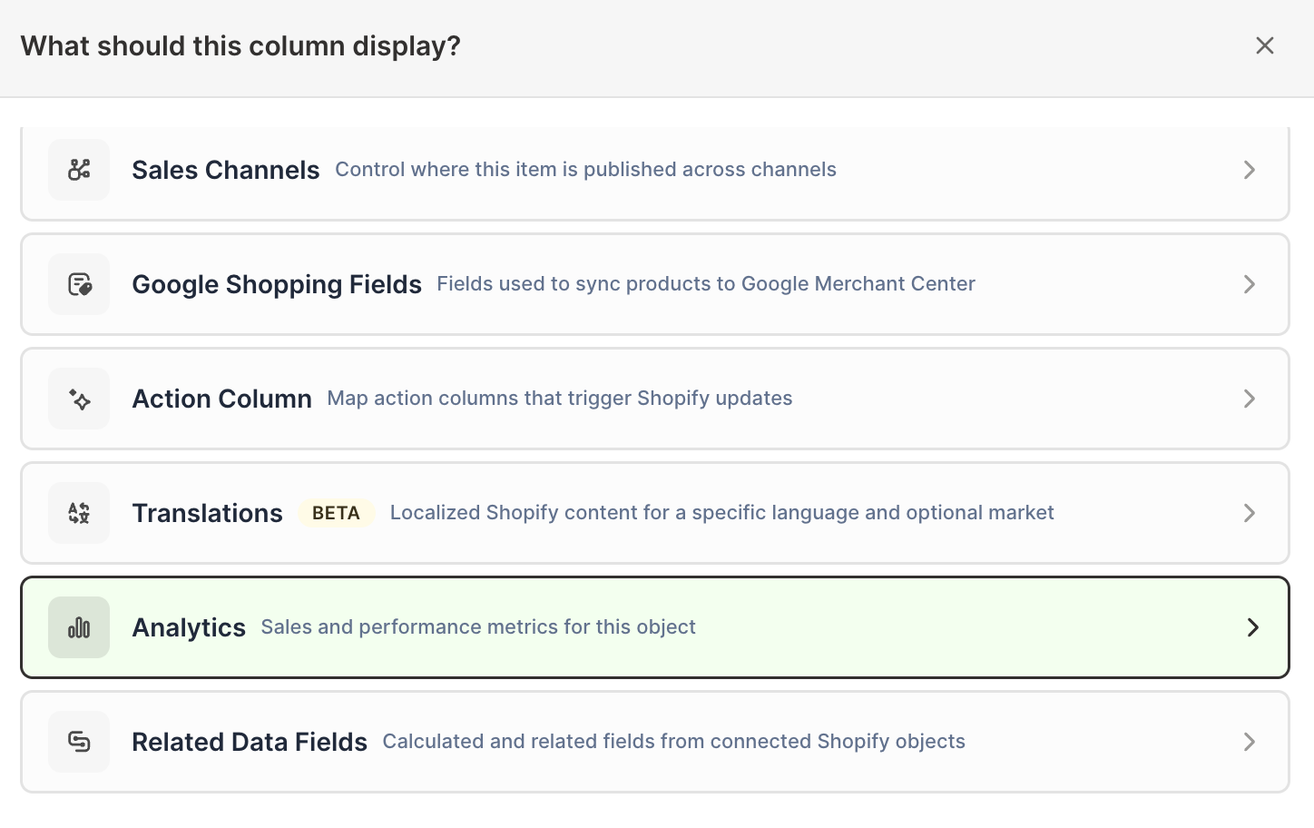
Click Sales & analytics in the list of sections on the left, or type the metric's name in the search box
-
Click the metric you want. The metric's settings open with it already chosen under Which metric?
-
Under Over what time period?, choose All time, Fixed dates, Rolling period, Calendar year, or Calendar month
-
Under Limit which orders count, add any optional filters supported by the metric
-
Click Save Column
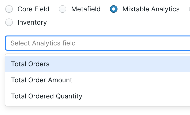
Add as many columns as you need. Because each one is independent, you can add the same metric two or three times with different timeframes or filters and compare them side by side. To give several columns the same timeframe later, click Change all time periods at the top right of the spreadsheet (see Change the time period of every column at once).
You can add analytics columns to Product, Product Variant, Collection, Customer, Company, and Company Location worksheets. Orders worksheets get analytics columns when you create them from the report library, for example with the Order fulfillment & delivery speed report.
What you can do with it
- Rank products by net sales while keeping SKU, price, cost, inventory, and status visible
- Build a customer list with lifetime spend beside names, emails, and tags, then export it for your email tool
- Compare this year against last year in adjacent columns, then add a formula for the change
- Compare two customer segments or two sales channels product by product
- Spot a variant selling out and act on it, since the record is right there
If you also use Mixtable Spreadsheet Editor, you can edit the Shopify fields on the same worksheet, review pending changes, and sync them. The report and the fix happen in one place.
See add analytics columns to a Shopify data worksheet for the full workflow.
Time Series worksheets
What it is
A Time Series worksheet turns a total into a trend. Time periods run across the columns as recent days, weeks, months, or years, and each row is either a store metric you are following or a group you are comparing.
This is the view for direction. A single number tells you where you stand, but only a sequence tells you whether things are improving, and seasonality is invisible until you see the same month across two years.
How it works
The layout depends on the breakdown you choose.
Choose Store and each metric becomes its own row: Net Sales, Gross Sales, Orders Count, Average Order Value, Net Quantity Sold, Total Refund Amount Excluding Tax, Refund Count, and Total Discount Amount, plus stock metrics such as Closing Stock under an Inventory heading. This is the classic monthly store summary.
Choose a business dimension and each group becomes a row instead, with one metric measured across the periods. Available breakdowns are vendor, product type, Shopify Market, customer segment, last-touch marketing channel, and location (one row per stock location, for inventory metrics). Not every metric fits every breakdown. Vendor and product type rows can’t show Average Order Value, for example, because each of those rows only counts its own items, while one order can include products from several vendors or product types. Check what a report row can show for the full list.
- Click the + button beside the worksheet tabs, or choose Worksheet > Add worksheet…
- Select Reporting worksheet, then click Continue
- Under Time series, choose a ready-made report, or choose Blank time series under Start from scratch
- Click Continue
- Under Break down by, choose Store or a business dimension
- Under Metrics or Measure, choose what the rows should calculate
- Under Time periods, choose By day, By week, By month, or By year, then how many recent periods to include
- Click Create Worksheet
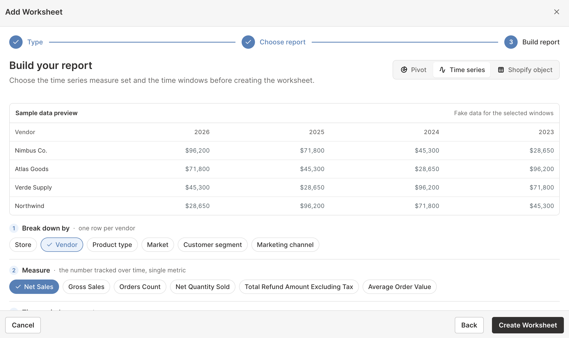
Mixtable can create up to 90 daily, 52 weekly, 36 monthly, or 10 yearly columns. You can also add your own rows afterward by right-clicking an empty row’s number and clicking Choose what to analyze…, which is how you get rows a breakdown cannot produce.
What you can do with it
- Produce the monthly store report you would otherwise rebuild by hand every month
- Compare the same month across years to separate seasonality from real growth
- Watch whether refunds or discounts are growing faster than sales
- See which vendors, Markets, or segments are gaining ground and which are fading
- Track one campaign channel’s contribution month by month
- Follow stock levels day by day or week by week, for the whole store or for each location
- Add growth and variance formulas beside the generated columns
See create a Time Series worksheet for Shopify data.
Pivot Table worksheets
What it is
A Pivot Table worksheet is built for comparison. Each row is a group of Shopify records, each column is a metric, and every group is measured the same way over the same timeframe.
Once you have more than a few hundred products, the useful pattern usually lives one level above the product. Which supplier earns the most, which category absorbs the most discounting, which segment places the largest orders: those are questions a ranked list of individual products cannot answer.
How it works
Choosing a breakdown generates every row at once. The options are vendor, product type, Shopify product category, product tag, Shopify Market, customer segment, and location (one row per stock location, for inventory metrics).
- Click the + button beside the worksheet tabs, or choose Worksheet > Add worksheet…
- Select Reporting worksheet, then click Continue
- Under Pivot table, choose a ready-made report, or choose Blank pivot table under Start from scratch
- Click Continue
- Under Break down by, select the group that should become the rows
- Under Metrics, select the calculated values for the columns
- Under Time period, choose the dates the metrics should cover
- Review the sample preview, then click Create Worksheet
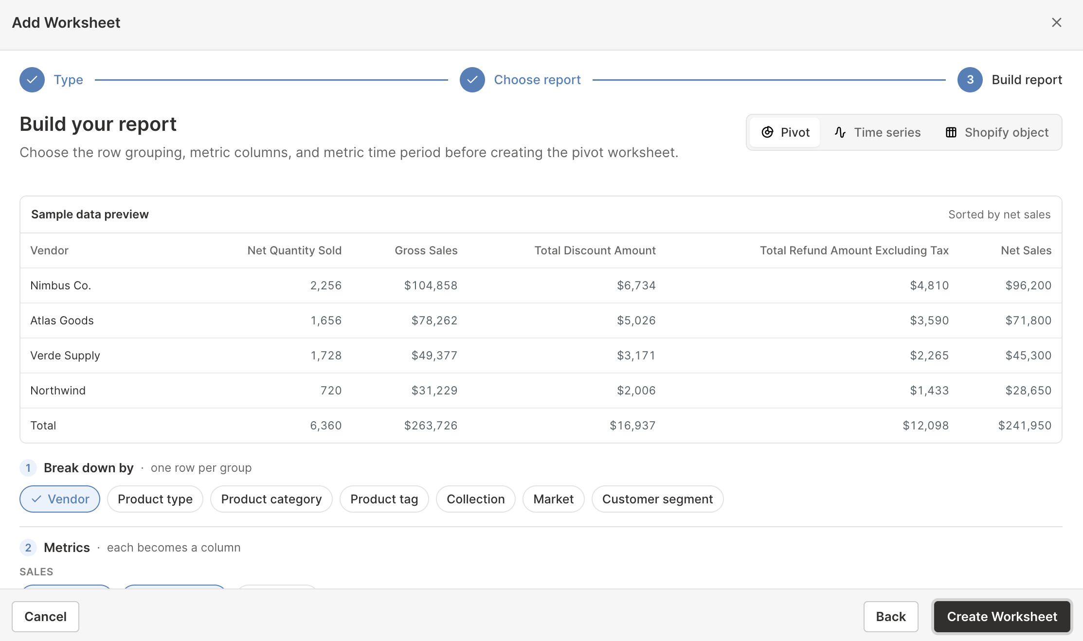
Breakdowns are a starting point, not a limit. Right-click an empty row’s number and click Choose what to analyze… to define a row yourself: pick the Shopify object it analyzes, then either include every record or write conditions that select exactly the ones you want. A row can be one vendor’s tagged products, your variants above a cost threshold, or your customers in a particular country, and it sits beside the generated rows in the same report.
What you can do with it
- Rank vendors, categories, or tags by net sales, discounts, or refund rate
- See how much stock, and how much stock value at cost, each vendor or location holds
- Find where discounting is concentrated, which is usually a category habit rather than a product decision
- Compare customer segments by what they are worth rather than how many people they contain
- Compare Shopify Markets side by side when you sell internationally
- Build custom rows for groups no single Shopify field describes, such as one vendor’s tagged products beside their untagged ones
- Sort by any metric, then add formula columns for shares and ratios
See create a Pivot Table worksheet for Shopify data.
How the three fit together
They answer the same question at different altitudes, and a real investigation usually moves between them.
A vendor Pivot Table worksheet shows that one supplier is behind a drop in net sales. A Time Series worksheet shows whether that vendor has been sliding for months or just had one bad one. A Shopify data worksheet with analytics columns then shows exactly which of that vendor’s products to reorder, discount, or drop.
Start wherever your question starts. Nothing stops you keeping all three in the same spreadsheet.
What you can analyze
All three approaches draw on the same metric catalog:
- Sales and quantities: Net Sales, Gross Sales, Total Sales, Net Quantity Sold, Gross Quantity Sold, and Refunded Quantity
- Orders and customers: Orders Count, Average Order Value, customer purchase behavior, segment membership, and average order quantities
- Refunds and returns: Refund Count, refund amounts, refunded-order percentage, return requests, return rate, returned quantity, open returns, and time to close
- Discounts: Total Discount Amount, discount campaign order counts, and allocated discount amounts where supported
- Profitability: Gross Profit, % Gross Margin, Amount of Cost of Goods Sold, and Orders Net Profit on supported variant reporting
- Order charges: Tax, shipping, duties, and additional fees
- Fulfillment: Fulfillment volume, fulfilled quantities, time to first fulfillment, and delivery speed
- Attribution: First-touch and last-touch sources, UTM values, attribution coverage, and time to conversion
- Inventory: Stock levels and stock value, in-stock rate and out-of-stock variants, sell-through, inventory turnover, and dead stock, on product, variant, and collection worksheets and in reports. See the Shopify inventory analytics guide
Availability varies by what you are analyzing. Use the Shopify analytics metrics reference to compare definitions and see which metrics belong together.
Control the dates and orders included
Each Pivot Table metric or analytics column can use All time, Fixed dates, Rolling period, Calendar year, or Calendar month. Time Series worksheets use separate columns for recent days, weeks, months, or years instead. Inventory metrics work a little differently: their history runs from October 1, 2023 through yesterday, so they have no All time, and metrics that show stock on a single day, such as Closing Stock, ask On what date? instead.
You can also limit which Shopify orders count toward a result. Depending on the metric, filters include customer segment, customer country, discount campaign, fulfillment status, B2B order type, company, order source, retail location, attribution values, fulfillment details, and return details. Inventory metrics take a Stock location filter instead, so you can count only the stock at the locations you pick.
Getting these two settings right matters more than any other choice, because comparing a partial month with a complete one, or forgetting a filter, is the easiest way to reach a confident but wrong conclusion.
Every report is still a spreadsheet
Whichever approach you choose, the result is a normal Mixtable worksheet. You can:
- Sort rows to find leaders and outliers
- Filter the worksheet without changing the underlying calculation
- Add formulas for growth, variance, ratios, targets, or rankings
- Add columns for notes and decisions
- Color cells by their values with conditional formatting, for example to flag low stock or a drop in sales
- Export the worksheet to CSV or the full spreadsheet to Excel
This is what makes it different from a fixed dashboard. When a report needs one more calculation specific to your business, you add it yourself: divide Total Discount Amount by Gross Sales for a discount rate, or compare this year’s Net Sales with last year’s for growth.
Reports and spreadsheet templates are different
A ready-made report adds one worksheet to the spreadsheet you already have open. A reporting template creates a whole new spreadsheet, sometimes with several worksheets and many preconfigured columns.
Choose a ready-made report when you want to add one focused analysis to current work, and browse them in the report library. Choose a reporting template when you want Mixtable to build the whole spreadsheet for you.