Mixtable is an online spreadsheet, designed from the ground up to bulk edit and analyze Shopify data.
Got a question? We're here to help! Reach out at [email protected], and we'll get back
to you promptly.
IN THIS ARTICLE
5 Steps to Making Your Shopify Store Accessible
Creating an accessible Shopify store isn’t just about legal compliance; it’s about inclusive design that broadens your customer base and improves the user experience for everyone. Following the Web Content Accessibility Guidelines (WCAG) 2.1 AA standard is the recognized best practice.
Below are the five most important steps to ensure your e-commerce site is accessible to people with disabilities, including those who rely on screen readers, keyboard-only navigation, or specialized software.
1. Implement descriptive ALT texts
Alternative text, or alt text, is the text description of an image that is read aloud by screen readers for users who are blind or have low vision. It is consistently cited as the number one accessibility issue in e-commerce. Missing or poor alt text prevents screen reader users from understanding what your product image, banner, or icon is meant to convey.
Best practices for ALT text:
- Be descriptive and concise: Describe the image’s content and its function on the page. For example, instead of “Image 123,” use “Flowing crimson silk maxi dress with spaghetti straps, viewed from the front.”
- Include relevant keywords: Use product names or types, but don’t stuff it with keywords—its primary purpose is accessibility, not SEO.
- Use null alt text for decorative images: If an image is purely decorative (e.g., a spacer or a border), use an empty attribute: alt="". This tells the screen reader to skip it.
Bulk update ALT text with a Spreadsheet Editor
You can add and update alt text for your product images in bulk using the free plan of the Mixtable bulk editor app. Here’s how to do it:
- After installing the app, load the Full Product info template. This will load your product and variant data into a spreadsheet, and you can export or manage it online using sorting, find/replace, and Excel formulas.
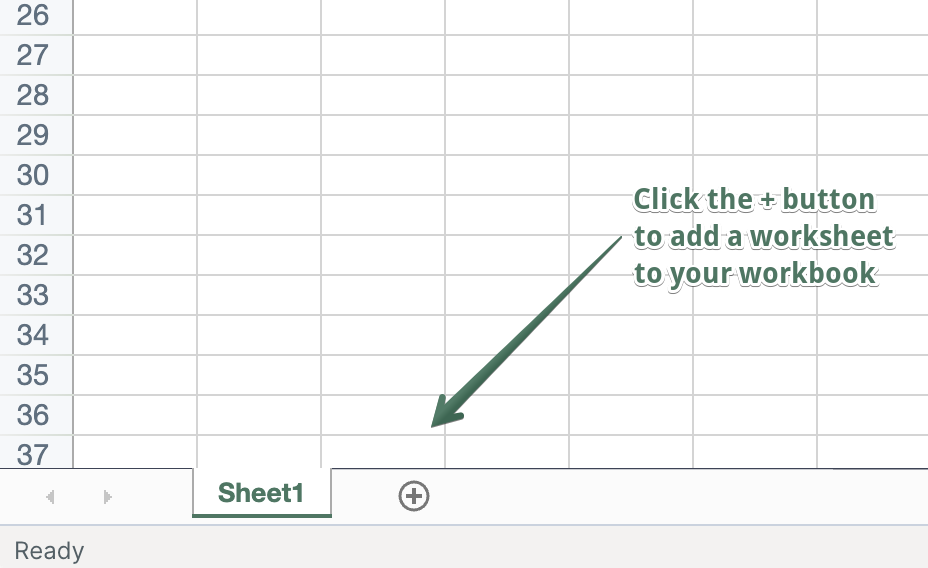
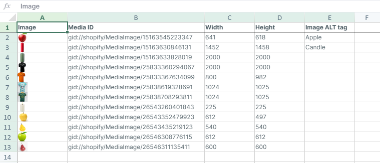
- Next, add a new worksheet with Media images using the (+) button.
- There you will see all your images, with their media IDs, dimensions, and the ALT tags.
- Next, you can export the spreadsheet as a CSV or XLSX file, or edit the ALT tags online. If you use the free plan, you need to import the file with the changes. In Mixtable, use the Sync with Shopify button to upload changes back to Shopify. This option is included in Mixtable’s paid plans.
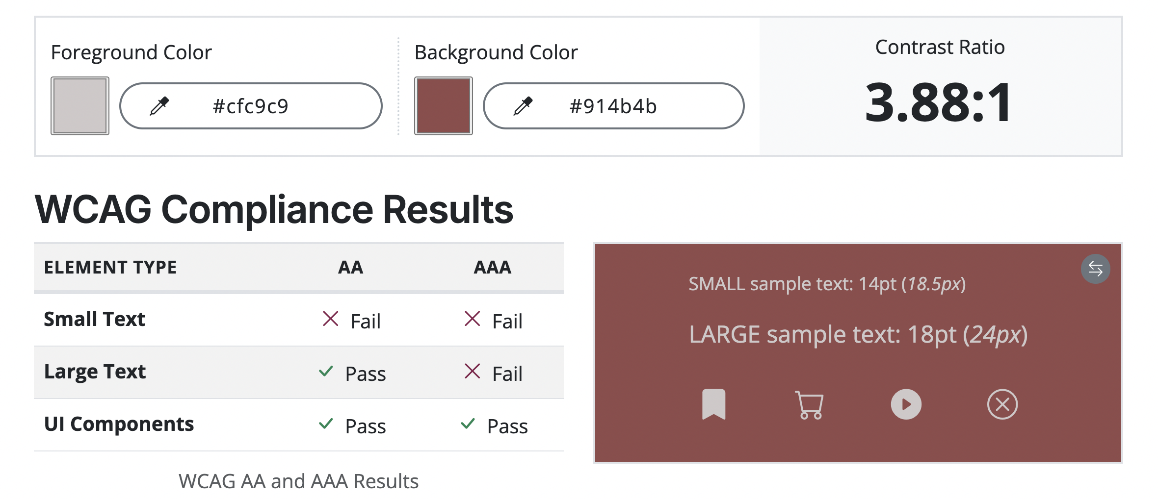
2. Ensure proper color contrast
Insufficient color contrast is a significant barrier for users with low vision or color blindness. WCAG 2.1 AA mandates specific contrast ratios between foreground text and its background color:
- Normal Text: A contrast ratio of at least 4.5 to 1.
- Large Text (18pt bold, or 24pt regular): A contrast ratio of at least 3 to 1.
This applies not only to body text but also to text on buttons, links, and even essential icons. Many default theme color schemes may fail this test, especially for light gray text on white backgrounds or brightly colored buttons.
How to do it: Use a free online color contrast checker tool to test all text elements on your store, paying special attention to your primary and secondary brand colors, for example, this Color contrast extension for Chrome.
3. Enable full keyboard navigation
Many people with motor impairments or those who are blind navigate the web using only a keyboard (using the Tab key, Shift+Tab, and Enter). Your store must be fully operable without a mouse.
- Visible focus indicator: As a user tabs through the site, a visible highlight or border (the focus indicator) must clearly indicate which element is currently selected. If this indicator is missing or too faint, the user gets “lost” on the page.
- Logical tab order: The order in which the Tab key moves through interactive elements (links, buttons, form fields) must be logical and follow the visual flow of the page (e.g., top-to-bottom, left-to-right).
- Accessible controls: All interactive elements, including product selectors, cart buttons, filters, and the checkout process, must be operable via the keyboard.
4. Use a clear and consistent heading structure
A well-structured document is essential for screen reader users, who often navigate by skipping from heading to heading to understand the page content. A page’s structure should be organized using HTML heading tags in a sequential, logical hierarchy:
- H1: Used only once, typically for the page title (e.g., the product name on a product page, or the home page’s main heading).
- H2: Used for main sections (e.g., “Product Description,” “Customer Reviews”).
- H3, H4, etc.: Used for subsections under the corresponding parent heading.
Note: Never skip heading levels (e.g., jumping from an H1 directly to an H3). The heading structure defines the content hierarchy, making your pages easier to understand.
5. Write descriptive and contextual links
Avoid generic link text like “Click Here,” “Read More,” or “View Details.” Screen reader users sometimes pull up a list of all links on a page to quickly navigate. When links lack context, they become useless.
How to do it: The link text should describe the destination or purpose of the link even when read out of context.
- Bad: “To learn more about our shipping policy, click here.”
- Good: “Read our full shipping policy.”
- Good (Product Page): “View the Burgundy Sweater in Size Medium.”
Accessible Shopify Themes
Choosing a modern, accessible theme provides a strong foundation for compliance, as developers often implement best practices for keyboard navigation and proper code structure. All of Shopify’s free Online Store 2.0 themes have undergone accessibility audits.
| Theme Name | Type | Key Accessibility Feature |
|---|---|---|
| Dawn | Free (Shopify) | Flagship theme, fully audited for WCAG 2.1 AA compliance. |
| Craft | Free (Shopify) | Clean markup, great foundation for customizing accessibility defaults. |
| Sense | Free (Shopify) | Built-in strong contrast options and intuitive keyboard navigation. |
| Studio | Paid (Shopify) | Keyboard-friendly carousels and focus on visual brand accessibility. |
| Kairo | Paid (Third-Party) | Premium features, including editable, highly visible focus indicators. |
You're ready!
Mixtable is an online spreadsheet designed to sync data with Shopify. It looks, feels, and behaves like Excel (including formulas), but runs in your browser. With Mixtable you can:
- Bulk add products to collections, edit metafields, add or remove tags;
- Change product prices, including international prices, and review price history;
- Manage customers with a spreadsheet CRM for Shopify;
- Use Excel features like sort ascending or descending, find-replace, filter, and more.
Best of all, you can sync changes back to Shopify with a single click. Find out more about the Mixtable suite of products here.